Preface: Builders Trust Capital
Logo, Branding, UX, UI, Styleguide, Custom Content, Digital and Physical Marketing
Created a sophisticated brand that appealed to their entrepreneur clientele and resonated with their core values of trust, stability and transparency.
Ashmore Partners came to me with a few issues they wanted to resolve. It all started with a phone call where the partners and I discussed their goals, where they were, where they were going and how they felt they were being held back.
Feeling like we would be a good fit, I sent them my client worksheet to dive deeper into the nuances of their goals, budget, timeframes and what a successful engagement looks like for them.
Case Study
Reshaping the Ashmore Partner Brand
Skills displayed
In this case study we'll explore what it took to elevate a hard money lender brand to be a step above. The pitch was to solve their identity refresh, logo, create a branding style guide with color, typography, space and sizing, custom website, content and print marketing material.
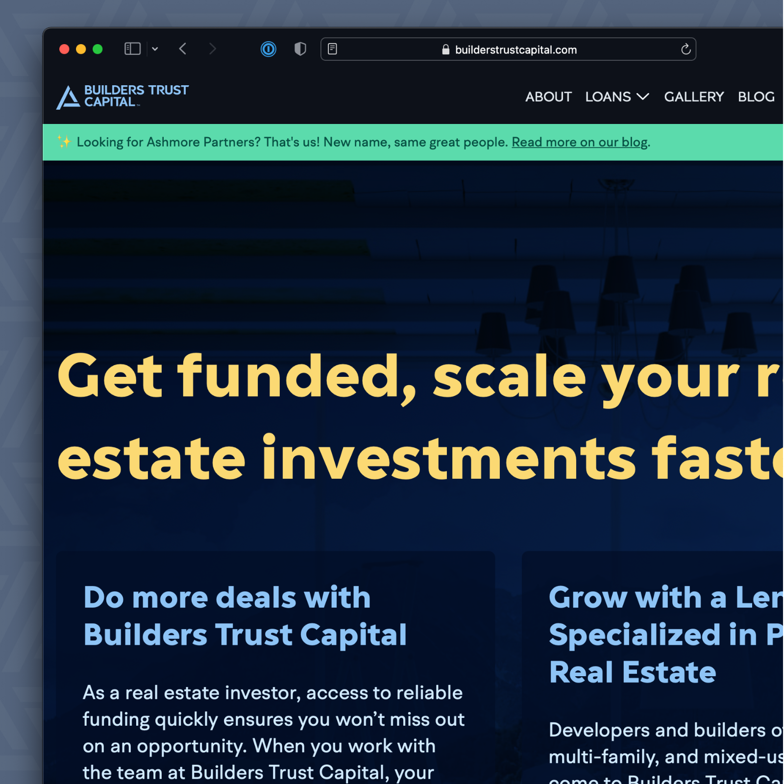
The Ashmore Partners team and I began to engage discovery sessions. They needed to speak to the entrepreneur audience as much as their investors. However, the website was to focus on converting potential entrepreneurs as that is what prospective investors will want to see.
We started the engagement with renaming the company and creating a unique logo that would stand the test of time. In tandem our copywriter Shannan Seely started interviewing clients and associates to gather their voice and establish tone. Talking to clients and associates ensures the content created is relevant and engaging for the audience.
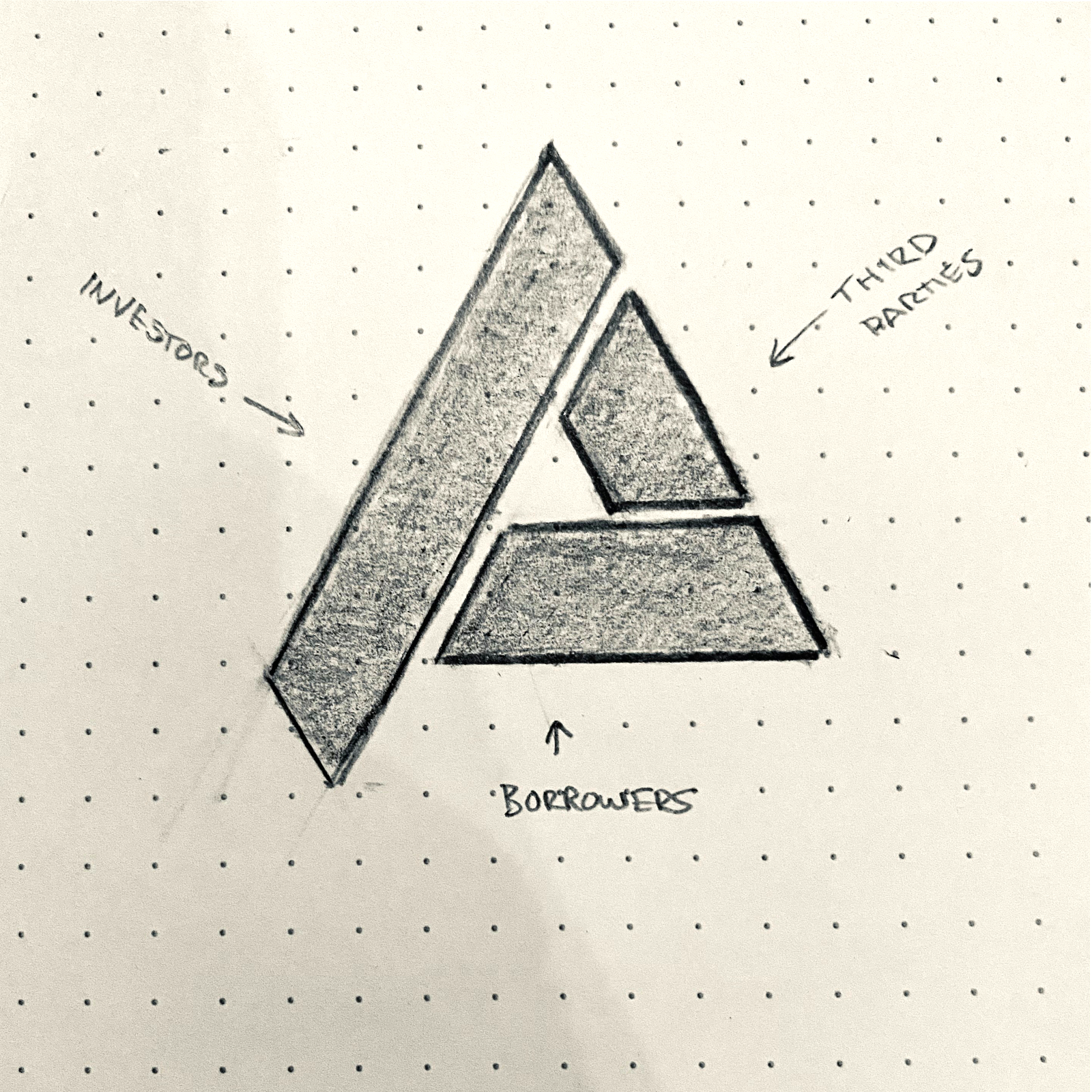
Out of the logo questionnaire session with Ashmore Partners we defined three adjectives that would be the brand's core principals. During decision making throughout our engagement we would ask "does this align with our core principals of trust, integrity and transparency?". This aided us in moving conversations from subjective responses to objective rationale. Instead of "I don't like purple" we can easily reframe to "Does this work for the brand?", which can be discussed in terms of "Is this in alignment with our core principals".
We dived deeper into industry research and built out a renaming exploration sheet with words related to their offerings, end results, core principals and related nouns and verbs. From that exploration we pitched a few names. Out of this exercise, Builders Trust Capital was born.
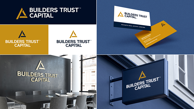
Simultaneously I collaborated with another designer sketching ideas for logos. Due to the digital and print presence we felt Builders Trust Capital should have a logo mark and logo type.The logo mark would look good as an avatar in the digital world and would pair well with a type logo when space afforded the opportunity. Our goal for the logo design was to pitch three or four that we felt best represented the brand.
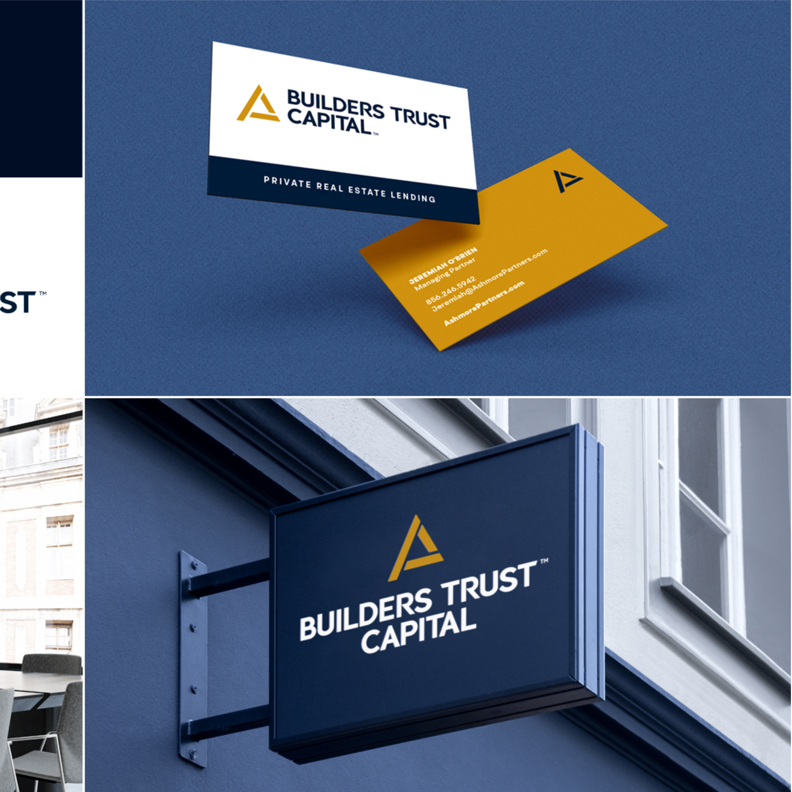
Once we had solid concepts, we created higher fidelity design and applied them to practical applications. These were relevant to where one might find the logo in the physical world and digitally. The logo presentation was resounding hit. The team at Builders Trust Capital had the real challenge to pick just one. After one was chosen and a few revisions made, we had a logo, brand colors and a typeface we could use for headings.
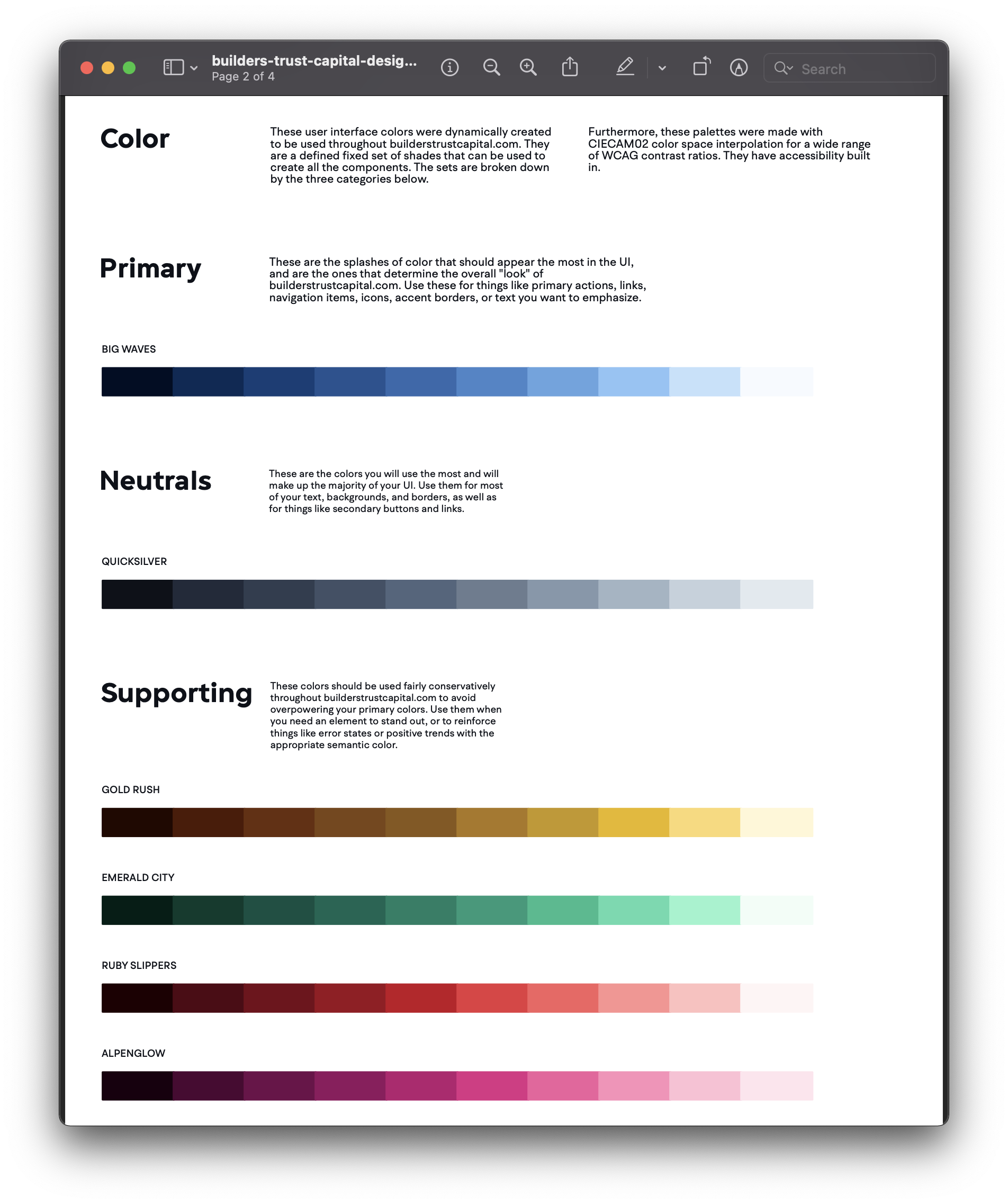
From there I created a style guide where we expanded the blue and gold colors, created neutrals and supporting colors with 10 variations. All done while keeping an eye on WCAG AA/AAA contrast ratios for digital, and PMS colors for print. We picked a paired typeface for body copy to match the one used in the modified type logo. Finally we put together logo and spacing and sizing guidelines.
Next up, we took to task redesigning their web presence. I decided that I would wireframe this in the browser. We were using the previous websites sitemap but creating a few marketing pages specific to their offerings.
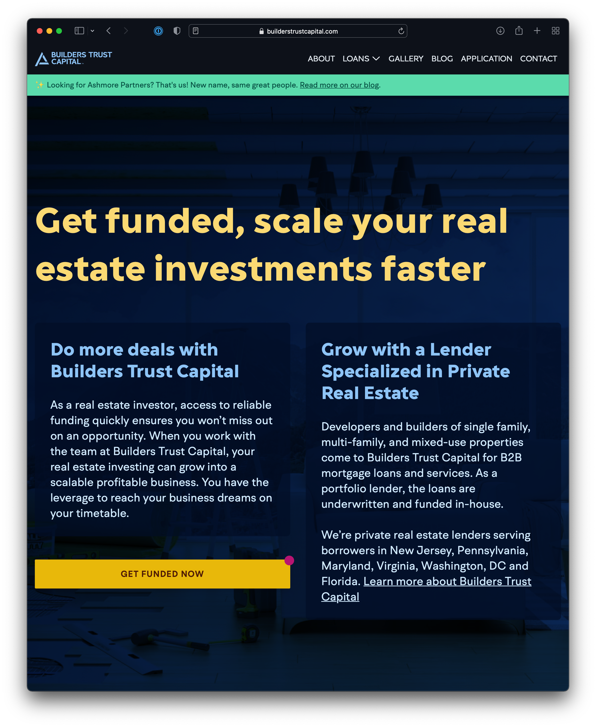
In the wireframing phase we started with a single marketing page. The structure was designed in the lighter end of the neutral color palette for now so we can focus discussions on the information architecture. By this time, Shannan had copy ready to share with the client. We were able to integrate drafts of the content for each page, live in the web. Feedback from the client could come from one place, where it was going to live. Gradually, the pages would get higher and higher fidelity. Accessibility, optimizations, browser testing and performance could be done simultaneously as the wireframe came alive.
With the content, structure and visual design approved I went above and beyond with polish and animations. It's important to note here that while designing and building out the structure I could also build this scaffolding to be fully responsive. From mobile devices to full desktop screens each section of every page with scrutinized to look good along every breakpoint.
Builders Trust Capital scaled to new territory and collaborating with new entrepreneurs, investors and third party vendors. We achieved their goal of creating a sophisticated brand that stood above the competition and they have increased revenue for all of their involved parties.