Preface: Roll
UX, UI, Design System
Combined business ideas with small business owner needs to create a new way to run payroll and manage HCM on the go with a mobile first approach from concept to component library.
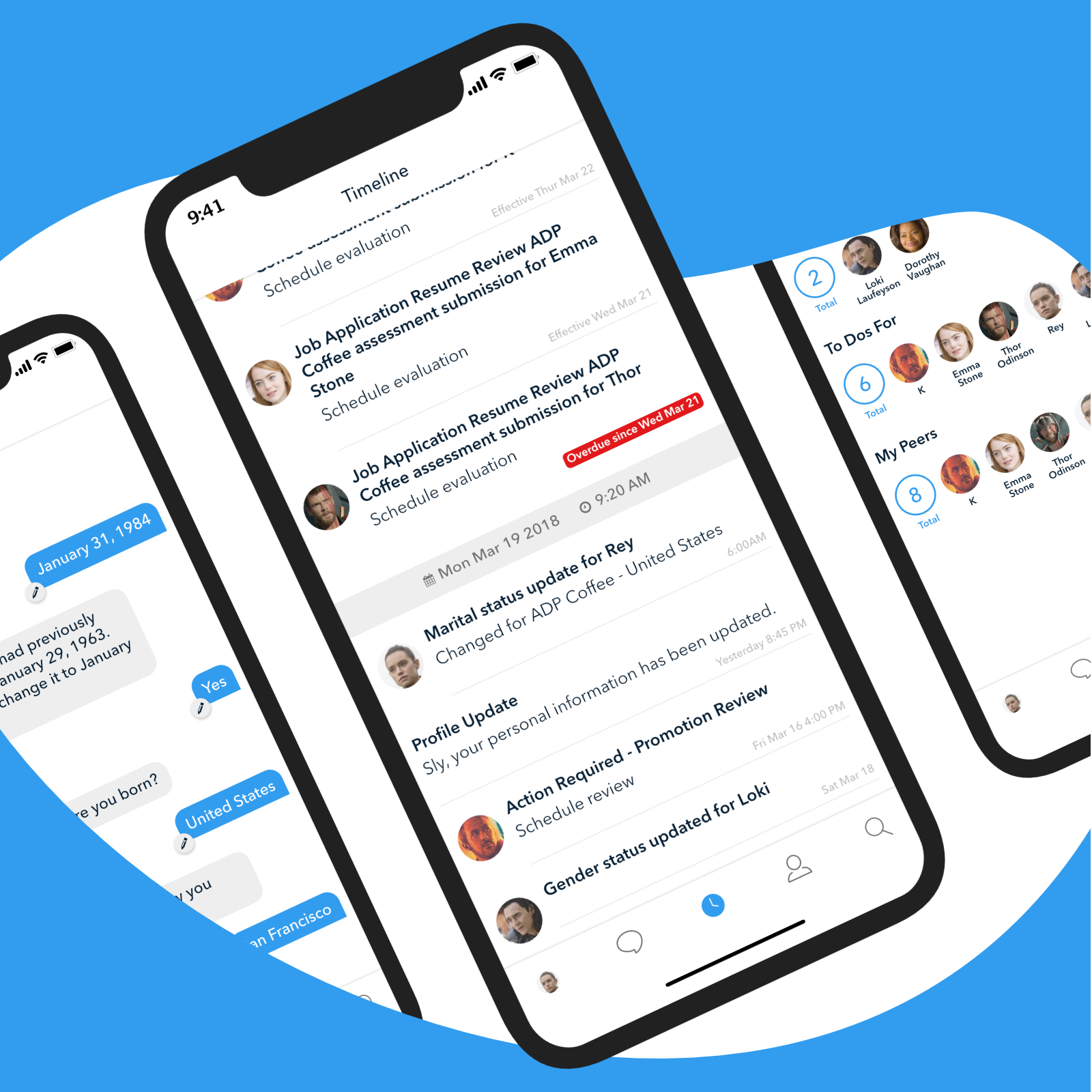
Roll by ADP is a self service app that allows business owners to run payroll and manage HCM through a chat bot with a sophisticated suite of ML algorithms and AI. Our workflow engine is based on event sourcing which captures actions and stores it in sequence. We apply this to a few user interfaces on mobile devices and desktop.
There are a wide array of attributes that can be applied to a manager or employee. They can be mixed and matched depending on the company, location and organization structure. What payment method do we use for our employees? Did they get a mid-cycle rise? How many hours did they work? Did they have overtime or sick time?
Case Study
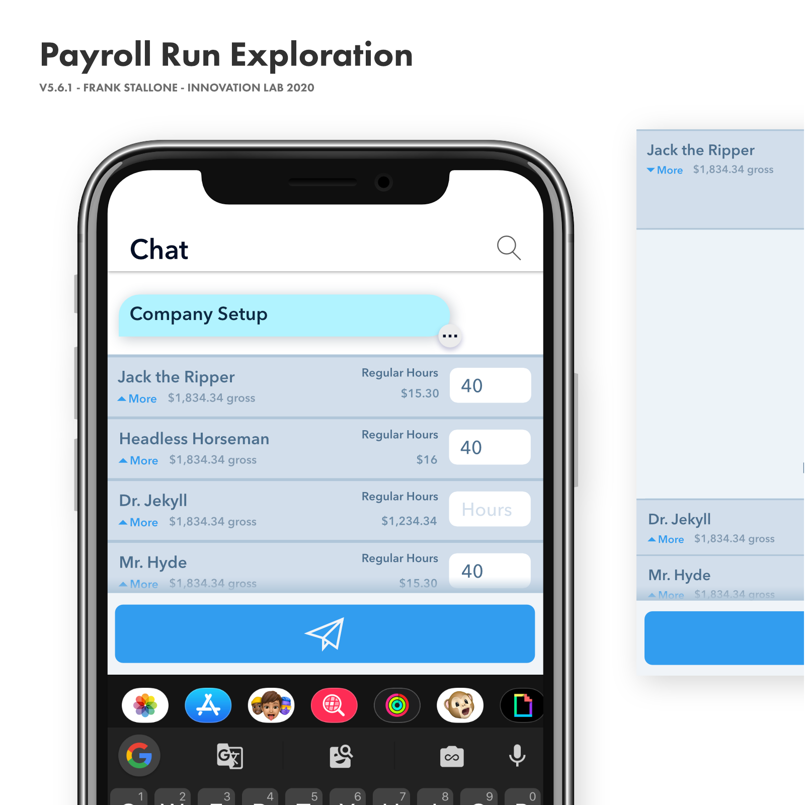
Payroll Run
Skills displayed
In this case study I'll be walking you through how I overcame the business challenges to get a clear and concise design solution for a manager managing employee's hours. Our team gathers in our main meeting room. From our SVP of Innovation, product owners to our architect and backend developers we are sitting with 50+ years of payroll and HCM knowledge. Everyone has a valid voice at this table.
We begin with discovery. I start by asking a few questions about the vast array of attributes any one employee can have associated with them. This quickly gets out of hand as there are many. We now know there needs to be a MVP that we can ship first and that we should focus on that today. To figure this out we write down all of the payroll workflows we have to design for and pick one.
We have decided to scope this discussion to a single payroll flow, a manager whose managing his employee's hours. Focusing on this flow will set the stage for what the UX and UI will look like, then we can come back and pressure test the design to see if it will solve our other payroll flows.
What would a manager expect to see in this view? I am writing down attributes on the whiteboard taking note of the discussions from our SMEs. It's becoming clear some of these attributes are not needed. This will be a list of employees for the manager to quickly scroll through, add hours in an input field and submit payroll. We want minimal friction and the least amount of cognitive load on these managers as possible.
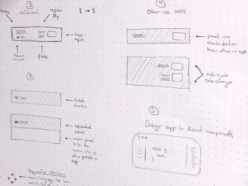
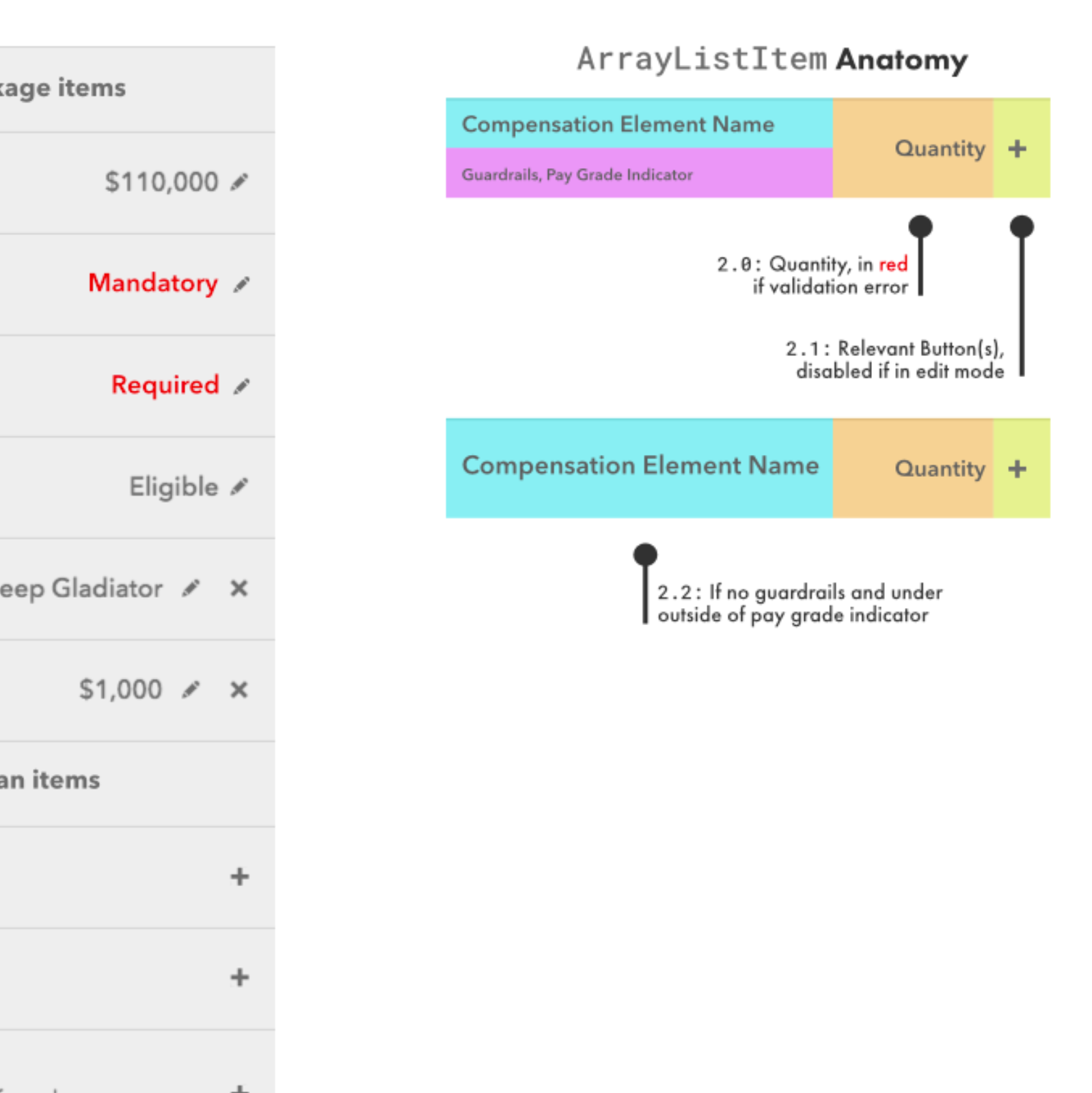
I start to see how an accordion design pattern could solve this. I know this design pattern can also be highly accessible. I proceed to draw out an example on the whiteboard explaining how an accordion works and how it can solve the business problem. This affords us the ability to hide attributes that are less common like overtime, bonus and payment type.
Everyone is in agreement. Now, we sit and talk about the hierarchy of the main attributes. Marking the whiteboard I'm educating the team on the importance of visual hierarchy. I'm also pressing them on being judicious about what becomes a main attribute to keep down the potential for cognitive overload. Finally we have a wireframe everyone is happy with. Before I move to building high fidelity mockups we discuss a few more use payroll flows. It passes the pressure test. Now I move to higher fidelity mockups with real data that we can use to discuss the visual hierarchy in more detail.
We need to consider edge cases and it helps to push the design limits with real names, numbers and data. Hopping into Affinity Designer at the time but Figma today I layout the accordion panels. I design an area to signal to users that there is 'more' they can do lay out the main attributes. I am talking to the backend developers clarifying data structures and thinking about how I'll be able to make these panel layouts pliable with flexbox. Working with the SME's I'm looking for ways to break this design with graceful fallbacks. How any decimal places will we encounter? What are the different pay cycles? What will we do when we're out of room when translated to German? I consider color, contrast ratios font size for readability and accessibility. Next, I bring in the supplementary attributes on the expanded panel portion of the accordion. We strip out any unnecessary design elements that do not serve a purpose. This keeps the user on task, focused.
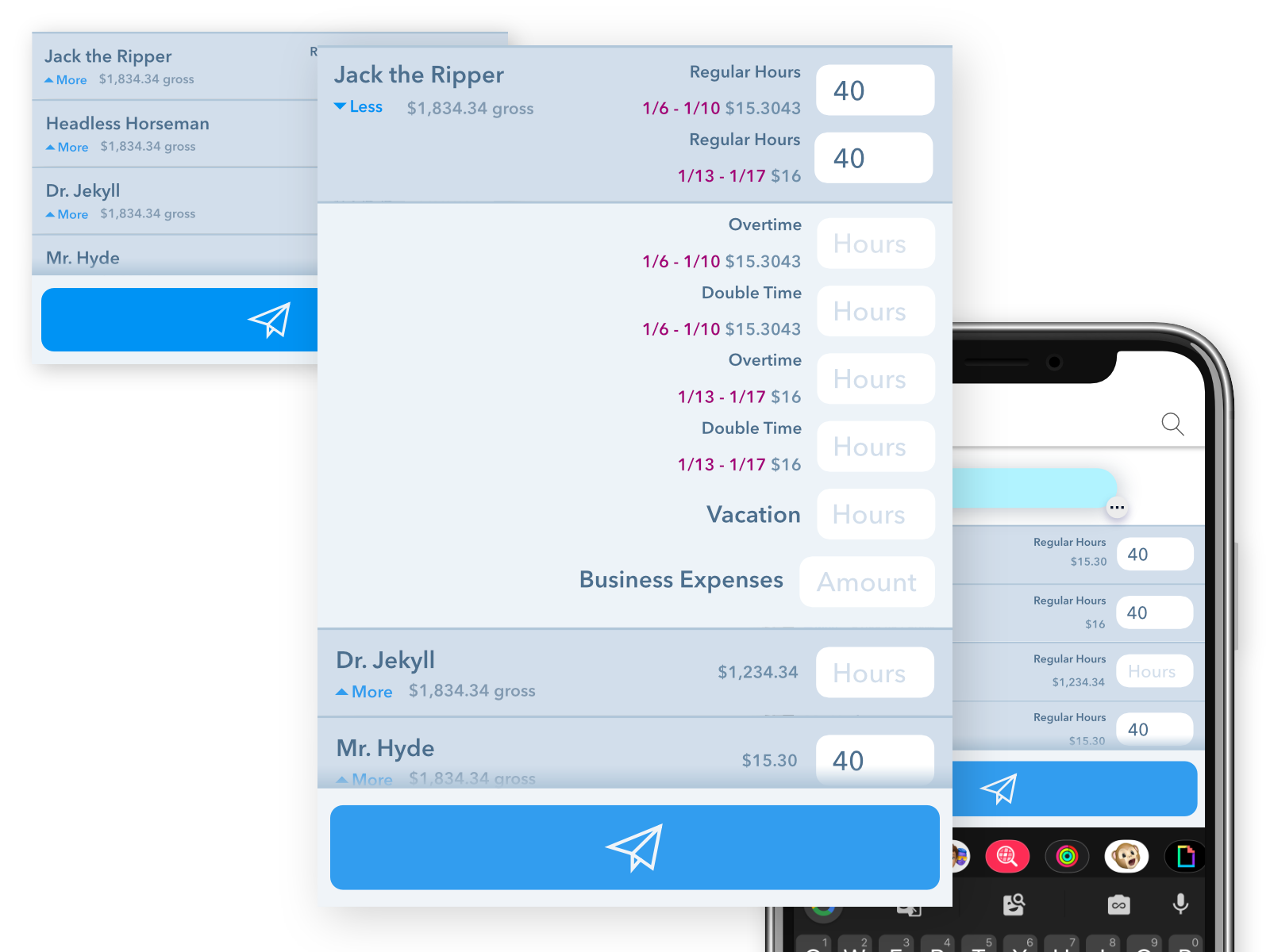
Finally, we have an approved suite of mockups. Time to move to our component library. I fire up Storybook and start building out the compound React components. We're using flexbox to layout the panel rows and columns within. I collaborate with the backend engineer about data structures to ensure the API is flexible.
There are a couple pitfalls of using flexbox and compound React components. The main one is that the backend engineer has more control over layout of the rows and their column alignment. CSS grid would solve this but technically is not applicable to this situation. Restricting the layout to only props for the front-end to style would stifle progress.
Instead of content breaking to a new line causing more height in the overall UI I setup these components to push off to the right. We aim for this to never happen but were pleased with how graceful it fails.
Once things are 80% complete I ship a beta version of our component library with this AccordionList component. The backend developer starts building out in our app on their local build environment. This is where we discuss what works and what needs to be modified. This gives me time to clean up imperative code that can be more declarative, finalize lower priority functionality and write proper documentation.
We've come full circle from discovery all the way to building out visually compelling, accessible React components in a component library. All of the fundamental elements are part of our design system and I can use Storybook or Figma components to layout all possibilities. Most importantly, we have a solid foundation for how employees and managers can manage their time and run payroll. 😄